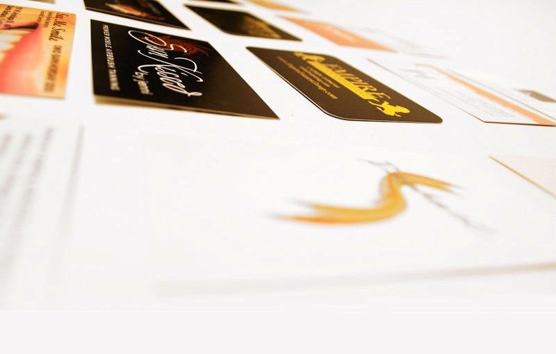
It may sound like common sense, but, subconsciously or consciously, a business card leaves an impression on the person to which it is handed. Do not underestimate your business card. It is an important aspect of business marketing and advertising.
Consider these two scenarios:
1) You are handed a business card, and the corners are peeling, the colors are dull, the paper stock is flimsy and weak, and there is no wow-factor
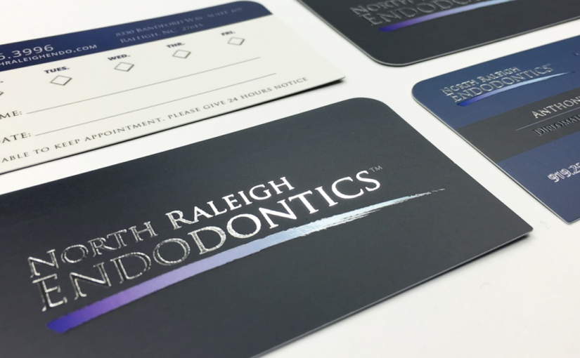
2) You are handed a business card with a creative design and logo that has four ¼ inch rounded corners, is printed with silk lamination, and has been printed with high-quality ink on high-quality paper stock
Logically, the second scenario is going to be the business card that you remember in a positive light—whether or not you decide to use that company/product/service. That lasting impression is what attracts new clients and customers.
Some of the Most Common Mistakes People Make in Print Jobs
1. Going with the basic 16pt Uncoated card stock without researching other options
- Nowadays, options for card stock are literally endless. Options include, but are not limited to, silk laminated, plastic business cards, wood, metal cards, and more. Options also include foil works, aqua foil, spot UV, matte/dull finish, and more.
2. Printing with an Outdated Logo and/or Graphics
- When was the last time you updated your logo? Never? Not necessarily a drastic change, but every so often, a logo should be reevaluated and made sure it is still relevant to the audience the client is trying to target. Grahpic design is a quickly evolving industry, and it is imperative to be kept up to date.
3. Trying to be too Decadent
- While it is important to have your business card stand out, if a card is too busy, oversized, or too ambiguous, a client is more likely to throw your card to the side rather than try and figure out what the business is about. Crazy designs and too many colors are too busy and hard on the eye. Secondly, a standard business card is 2” x 3.5”. This size is sure to fit in male and female wallets and other organizational products meant for business cards. Why go bigger? The inconvenience of an oversized business card is sure to throw people off. Lastly, if the client cannot figure out what your business is about from looking at your card, what is the point of investing in a business card in the first place?
4. A Lack of Marketing on the Business Card
- Is there anything on your business card that encourages the person to respond? A business card needs to be enticing and display the correct company information. However, another important aspect is some form of marketing that encourages the person holding your business card to act and contact you.
Most importantly, remember to hand your business cards out!
Global Creative Studios, an in-house one-stop shop for business development located in Los Angeles, CA., is equipped with the creative think tank required to create or revamp a logo, design a business card with the idea of final production in mind, and inform the client on what will work best for them. Our designers will let the client know what aspects would look good with foil, spot UV, aquafoil, etc. Our team has the end result in mind, which is most beneficial for clients.
Global Creative Studios is prepared to sit down with you and brainstorm ideas to best represent your company and entice people to respond and become actual clients.
For press and for more information about GCS, contact Pedram Doustkam, “Peter Doust,” by calling (818) 344-4884. Global Creative Studios’ website is https://www.globalcreativestudios.com and address is 19634 Ventura Blvd. #115, Tarzana, CA 91356.


